

A calm digital home for Iridescence Counselling Services.
Psychotherapist and clinical supervisor Jane Cundasamy offers therapy, supervision, group work, ecotherapy and professional training. Her Squarespace website had one job: let each of those audiences find their path — without the practice losing its single, human identity.
01 Overview
Six connected services. One practice. One website.
SQSP Agency designed and built the Iridescence Counselling Services website on Squarespace for psychotherapist and clinical supervisor Jane Cundasamy. Her practice spans individual psychotherapy, clinical supervision for other practitioners, therapeutic group work, ecotherapy, and workshops and CPD training — connected professional services, each with its own audience and its own way of being found.
The project covered the full journey: website structure and information hierarchy, page and visual design, refinement of Jane’s existing logo, content organisation, mobile refinement, the privacy and GDPR presentation a therapy practice needs, domain and launch coordination, and a handover that left Jane able to run the site herself. This is the kind of custom Squarespace website design work where the thinking matters as much as the pixels.
02 The real challenge
Every visitor asks the same question: is this for me?
Jane does not offer one simple service. A prospective therapy client, a counsellor looking for a clinical supervisor, a practitioner booking CPD training, and someone curious about group work or ecotherapy all arrive at the same front door — each carrying a different question, and each deciding within seconds whether this website is relevant to them.
That is the trap for multi-service practices. Explain everything at once and the site feels fragmented and overwhelming; flatten everything into one generic message and every audience feels vaguely addressed, none directly. The work was to separate the pathways cleanly while keeping one coherent professional identity — so the website reads as one practice with depth, not five small businesses sharing a homepage.
Discovery
“Before anything else, a therapy website has to help the right person feel they’re in the right place.”
The project began with Jane’s practice rather than with pages: how she works, who each service is for, and the tone that would feel true to the room she creates — calm, grounded and human. Just as clear was what to avoid: nothing clinical and cold, nothing that leaned on wellness clichés, and nothing that would make a careful, trauma-informed practice look like a template with the names changed.
03 Creating the website structure
A separate front door for every audience.
The answer was information architecture before design. Each service got its own dedicated page, written for the person actually looking for it, and the homepage was shaped to route each visitor to theirs quickly — scan first, read deeply once you’ve found your path.
A safe first step
Individual Psychotherapy, How I Work and the FAQs answer the questions someone considering therapy actually carries — how sessions work, what to expect, and whether this feels like the right fit.
Supervision & CPD
Clinical Supervision and Workshops & Training speak to counsellors and therapists in professional language — a different audience, a different decision, deliberately kept on separate pages.
Room to be distinct
Group Work and Ecotherapy each stand on their own, so less conventional offerings are explained properly instead of being squeezed into a services list nobody reads.
The finished structure

04 Building trust through design

Calm on purpose, credible by structure.
The visual system is built from a deep green, a warm cream and a soft sage, carried by clean Inter-based typography and generous whitespace. It reads as calm, grounded and professional — therapeutic without the clichés the sector leans on. Jane’s original tree-and-person logo concept was kept and refined into a more contemporary mark, so the identity stayed hers.
Credibility is handled structurally rather than with adjectives: the About Jane and How I Work pages set out her background, integrative approach and BACP registration in a clear hierarchy, and the FAQs and privacy policy are written to reflect how the practice genuinely operates — including how client information is handled.
05 Making workshops easier to promote
A home for programmes that keep changing.
Workshops and CPD programmes are the fastest-moving part of Jane’s practice — new dates, new cohorts, new courses. They needed somewhere to live and grow without unsettling the therapy side of the site, where a calm, stable first impression matters most.
The dedicated Workshops & Training page carries current programmes, dates and fees in one predictable place, and a site-wide announcement bar points professional visitors to it without shouting at therapy clients. When a programme sells out or a new one launches, one page changes — the rest of the website stays still.

06 Designed for mobile, on a clean foundation
Small screens carry the biggest moments.
Someone considering therapy is more likely to be reading on a phone, in a quiet moment, than at a desk. The mobile experience keeps the same unhurried hierarchy as desktop — one idea at a time, comfortable type, and the next step always within reach — so nothing about the small screen feels compressed or rushed.
The parts nobody sees.
Under the design sits the groundwork a professional practice needs: descriptive headings and structured content, optimised imagery, a tested contact journey with the privacy notice a therapy enquiry form should carry, a GDPR-conscious privacy policy, and the domain connected and launch coordinated so going live was an event for Jane — not a risk.

07 Handover and self-management
Built so Jane doesn’t need us for every small change.
A practice website only stays useful if its owner can keep it current. Jane has full access to her Squarespace site, and the handover included short tutorial videos covering the everyday edits she actually needs — recorded against her own pages, not generic examples. Bigger structural or design changes remain specialist work; the day-to-day is hers.
Changing text
Updating copy anywhere on the site — from a fee on the workshops page to a paragraph on the About page — without touching the layout around it.
Replacing images
Swapping imagery while keeping crops, proportions and loading behaviour intact, so the pages keep their calm composition.
Updating workshops
Adding new programmes, dates and fees to the Workshops & Training page — the edit Jane makes most often, made routine.
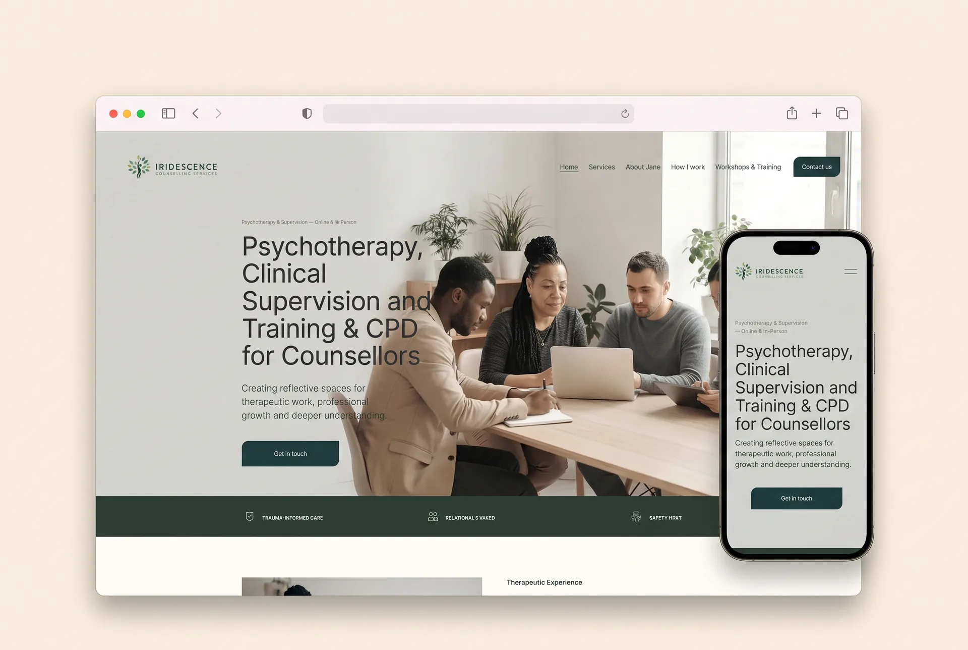
The finished website
See it in context.
The clearest way to judge structure is to move through it — from the homepage’s quiet routing to the service pages and the workshops hub.
Client feedback following launch

“Thank you so much for all the hard work and careful thought and time you put into creating my website.”
“I am really pleased with how it all turned out.”
Jane Cundasamy
Founder, Iridescence Counselling Services
08 Questions this project answers
For practices weighing the same decisions.
The questions below come up in almost every conversation with therapists, counsellors and practitioners considering a new website. The Iridescence project is a useful, concrete answer to each.
A custom Squarespace website, designed and built end to end: information architecture, page design, content structure, logo refinement, mobile optimisation, privacy and GDPR presentation, domain and launch coordination, and handover with tutorial videos.
Squarespace gives a solo practitioner reliable hosting, a professional design standard and — most importantly — the ability to make everyday updates without a developer. For a practice whose workshops and CPD programmes change several times a year, that self-sufficiency matters.
Yes — routine updates are very manageable. Jane has full access to her site and short tutorial videos covering the edits she actually needs: changing text, replacing images and updating workshop listings. Larger structural or design changes are still best handled by a specialist.
Yes, if the structure is right. Each service needs its own page with its own audience in mind, a homepage that routes people quickly, and one consistent visual identity holding it all together. That is exactly how the Iridescence website is organised.
At minimum: a clear statement of who the practice helps, a page explaining how the therapist works, professional background and registration details, honest answers to common questions, a privacy policy that reflects real practice, and a simple way to get in touch.
Yes. Therapist and counsellor websites are a core specialism — alongside Iridescence Counselling Services, SQSP Agency has built Squarespace websites for psychotherapists and counsellors in the UK and US, and a dedicated therapist website design service.
Project reflection
Complexity was the raw material. Clarity is the result.
Nothing was removed from Jane’s practice to make this website work — therapy, supervision, groups, ecotherapy and training are all here, each given its own room. What changed is how a stranger meets it: a first screen that says who this is for, pathways that separate cleanly, and one calm identity holding it together. The transformation is from a complex practice that was hard to explain to a live Squarespace website that explains it in seconds — the same challenge at the heart of our therapist website design work generally.
Related services
More Work
View All ProjectsFor multi-service practices
Your services are clear to you. Your website should make them clear to everyone.
If your practice has grown but your website hasn’t grown with it, we can help turn what you offer into a clearer, more credible Squarespace website. Let’s talk about yours.