

Most people begin a new website the same way. They open the Squarespace template gallery, scroll through several hundred beautiful demos, and try to work out which one is them.
It is a reasonable instinct. It is also, in our experience, the single most over-weighted decision in the entire process.
We build and rebuild Squarespace sites for consultants, coaches, therapists, founders and professional services firms. Across those projects, the pattern is consistent: the sites that fail rarely fail because of the template. They fail because of the words above the fold, the absence of a clear next step, the photography, the load time, or the fact that nobody ever decided what the site was supposed to do.
This guide explains what a Squarespace template genuinely determines, what it never will, and how to make the choice in about twenty minutes.
The short answer
If you want the conclusion before the reasoning:
On Squarespace 7.1 — the version every new site is built on — templates are starting points on a single shared system, not separate products. Every 7.1 template runs on the same underlying platform, the same section library and the same style controls. Any 7.1 site can, with work, be made to look like any other 7.1 site.
That means your template choice sets your starting distance from the finish line, not your ceiling. Choose the demo whose structure is closest to the site you actually need, ignore the demo photography entirely, and move on.
The decisions that determine whether the site earns you clients happen after that.
What you are actually choosing
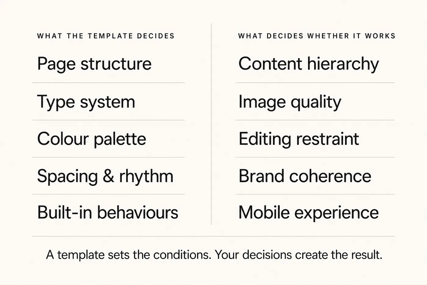
This is where most guides go wrong. They compare templates as though they were products with different capabilities. On 7.1 they are not. Here is the honest division of responsibility.
| What the template genuinely decides | What the template will never decide |
|---|---|
| Your starting section layouts and page order | Whether your positioning is clear in five seconds |
| Default fonts, colours and spacing (all editable) | Whether visitors understand what you sell and to whom |
| How much rebuilding you do before it feels like yours | Whether there is a single, obvious next step on every page |
| The tone the demo suggests to you | Whether the site loads quickly on a real phone |
| Which stock arrangement you start from | Whether Google can tell what the site is about |
Every item in the right-hand column is a decision you make — not one the template makes for you.
Read that right-hand column again. This is the reason two businesses can buy the same template and end up with entirely different results.
Squarespace 7.1, 7.0 and Blueprint: which one you're on matters more than which template you pick
There is one genuine platform decision hiding behind the template question, and almost nobody explains it clearly.
| Squarespace 7.1 | Squarespace 7.0 | Blueprint (guided setup) | |
|---|---|---|---|
| What it is | The current platform. All templates share one code system | The legacy platform. Templates were distinct families with different features | A guided flow that assembles a starting site from your style and layout answers |
| Switch template later? | Yes — style and section changes, no rebuild required | No — switching families is effectively a rebuild | You are building on 7.1; the same rules apply |
| Feature differences between templates | Essentially none | Significant — some features existed only in certain families | None |
| Who it suits | Every new site | Existing sites only | Someone who wants a starting point fast, not a finished one |
| The catch | Freedom means the design decisions are genuinely yours | You are on an ageing system with a migration ahead | It produces a competent starting point, never a strategy |
If you are starting a new site today, you are on 7.1 — and the "which template" anxiety is mostly unfounded.
Two practical consequences.
If you are starting fresh, you are on 7.1, and you can change your mind later without rebuilding.
If you are on 7.0, the template question is the wrong question. The real question is when you migrate — and whether you take the opportunity to fix structure and messaging at the same time. That is a website redesign conversation, not a template one, and the sequencing matters: a straight lift-and-shift migration reproduces the problems you already had, at cost.
Blueprint deserves a fair hearing. It is genuinely useful for getting from a blank screen to something workable quickly. What it cannot do is decide what your business should say, in what order, to whom. It produces arrangement, not argument. Treat its output as a draft.
The five things that actually decide whether a Squarespace site works
If the template is not the lever, what is? In our project work the same five factors separate sites that generate enquiries from sites that simply exist.
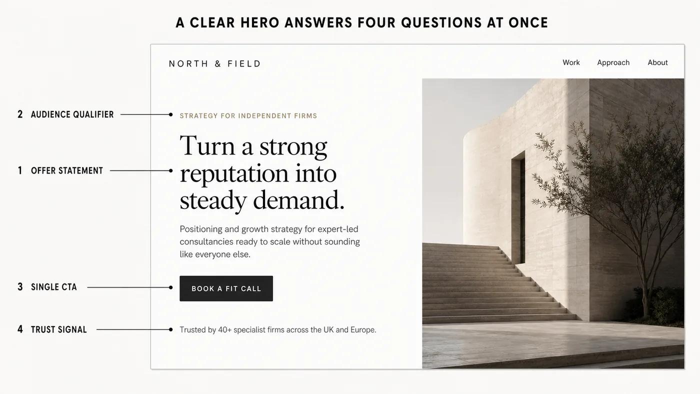
1. Clarity above the fold
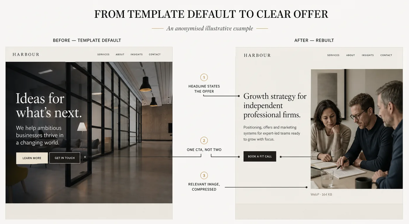
A visitor should know, without scrolling, what you do, who it is for, and what happens next. Not your tagline — your offer. "Executive coaching for founders scaling past their first ten hires" beats "Unlock your potential" every time, and it is not close.
This is the single highest-leverage change in most rebuilds, and it costs nothing but the decision.
2. One obvious next step per page
Multiple competing calls to action are the same as none. Pick the one action you want — book a call, request a review, download the guide — and make everything else secondary. We have covered the related failure in detail in why your contact form is killing your conversion rate; the short version is that every additional field is a reason to leave.
3. Photography that does not fight the words
This is the most common way a beautiful template becomes an ordinary site. Demo templates are photographed by professionals, colour-graded to sit behind text, and compressed properly. Client photography usually is not.
Two specific failure modes we see constantly:
- Busy or bright images with text laid over them. The text becomes unreadable at some viewport, always. If the image is busy, move the caption off it.
- Unoptimised uploads. A 4MB hero photograph will undo every other performance decision on the page, on every device, for every visitor.
4. Speed on a real phone, not on your desktop
Squarespace is fast enough. Most slow Squarespace sites are slow because of what was added to them: oversized images, multiple embedded widgets, marketing tags stacked on top of each other, decorative animations around the hero.
That last one is worth naming, because it is counter-intuitive. Entrance animations and infinite decorative motion in or around the hero can make a page genuinely hard for performance tools to measure, and hard for a visitor to read. We have had to strip exactly this from real projects to recover a measurable score.
5. Structure Google and AI assistants can read
Clear headings, one idea per section, real answers to real questions, and a page that states plainly what it is about. This serves conventional search and the newer answer engines equally — and the second is no longer theoretical. On our own site, AI assistants are already a measurable referral channel, distinct from conventional organic search.
Templates do not do any of this for you. It is the substance of Squarespace SEO work.
How to choose your template in twenty minutes
A repeatable process, in order. It is deliberately short.
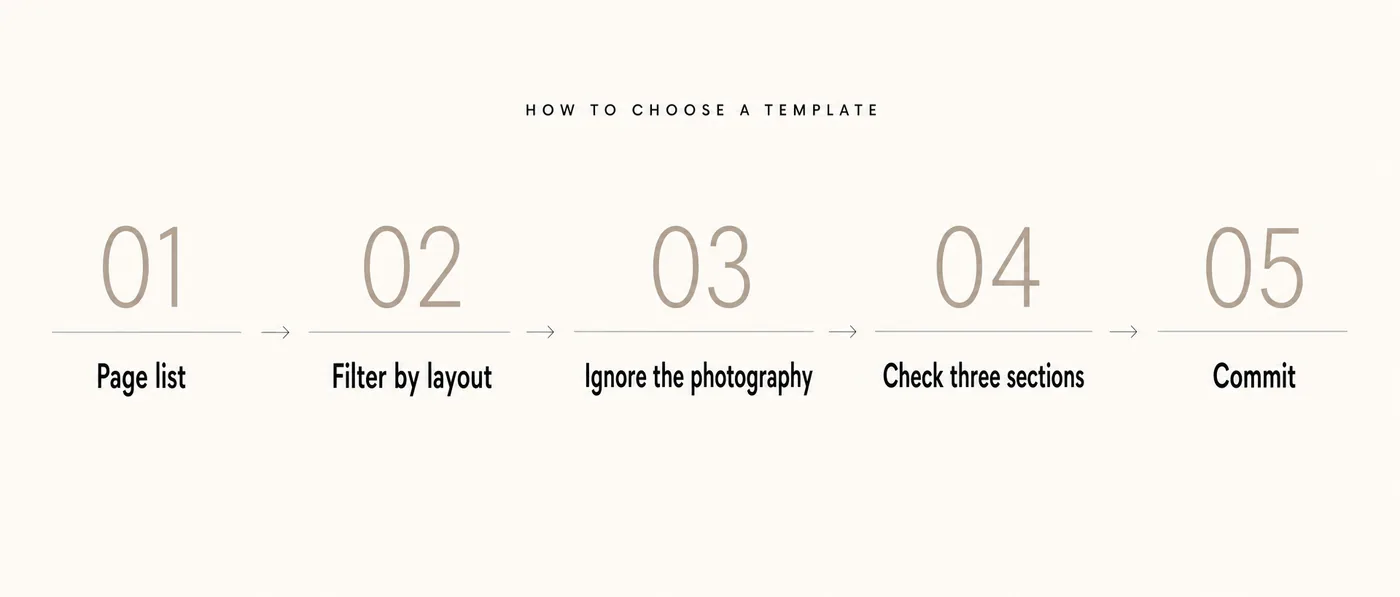
- Write your page list first. Before you open the gallery, write down the pages the site needs and the sections each page needs. Home, about, services, proof, contact is a perfectly good default for a professional services firm. Doing this first means you are shopping for a structure, not a mood.
- Filter the gallery by layout, not by industry. Squarespace's industry categories are loose. A template filed under "photography" may be structurally perfect for a consultancy. Look at how the demo arranges information, not what business it claims to serve.
- Mentally delete every photograph. Look at the demo in greyscale if it helps. What remains — the spacing, the type hierarchy, the section rhythm — is what you are actually buying.
- Check the three sections you will use most. For professional services, that is almost always: a hero, a services or process block, and a testimonial or proof block. If those three read well in the demo, the rest will follow.
- Pick one and stop. You can change fonts, colours, spacing and section layouts afterwards without a rebuild. Deliberating for a further week has a real cost and no benefit.
You don’t need a subscription to run this process — start a free Squarespace trial, no card required, and test your shortlisted templates with your real page list before paying anything.
Affiliate link — if you go on to subscribe, Squarespace pays us a small commission at no extra cost to you.
What to look for, by business type
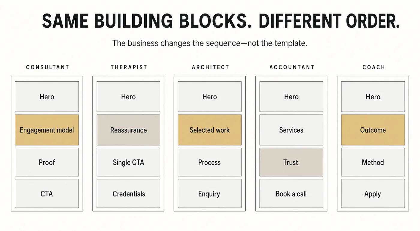
The useful advice here is not a list of template names — those change, and a name without a reason is worthless. It is a list of the structural features each kind of business actually needs.
| Business type | The section you must have | Commonly over-prioritised | The structural risk to avoid |
|---|---|---|---|
| Consultants | A clear engagement model — how working together actually goes | A long "about" narrative | Templates built around a portfolio grid; you sell judgement, not artefacts |
| Coaches | Proof of outcome, in the client's words | An image-led hero with an abstract promise | Heavy photography demos that flatter the coach and say nothing to the client |
| Therapists | A calm, low-friction path to a first conversation | A services list that reads like a taxonomy | Any template whose default tone is loud, high-contrast or urgent |
| Founders / startups | A one-sentence explanation of what the product does | A features grid before the reader knows the category | Demos designed for launched, funded companies with logos to display |
| Professional services | Credentials and regulatory clarity, visible early | A stock "corporate" hero image | Templates with no natural home for compliance or accreditation detail |
Choose for the section you cannot do without, not for the one that looks best in the demo.
The mistakes we are hired to undo
These are the recurring ones, in rough order of frequency and cost.
Choosing the template that flatters the founder rather than serving the client. Beautiful, image-forward demos are seductive. They are also frequently wrong for a service business, where the visitor's question is "can this person solve my problem" and not "does this person have taste".
Treating the demo content as a brief. The demo copy is placeholder written to make the layout look good. Keeping its structure means letting a stock designer decide your argument.
Building the desktop layout and checking mobile at the end. Squarespace's newer drag-and-drop editing lets you position elements freely — and desktop and mobile layouts are adjusted separately. Elements moved freely on desktop do not always land sensibly on mobile. Check both as you build, not afterwards. Most "broken on mobile" complaints we receive trace back to exactly this.
Adding sections because they exist. Every passive section — a decorative gallery, an unnecessary quote block, a second about paragraph — is another reason to leave before reaching the enquiry form. Fewer, better sections outperform more. We cover the wider pattern in why your Squarespace site doesn't generate leads.
Rebuilding when a fix would do. Not every underperforming site needs replacing. Sometimes the messaging, the CTA and the images account for the whole gap. We wrote about the distinction in website redesign vs website fix, and the honest answer is that a fix is often the better commercial decision.
When a template is the wrong starting point altogether
For completeness, there are cases where beginning from a stock template genuinely costs more than it saves:
- You have a defined brand system — typography, palette, spacing rules — that the template will need to be rebuilt to accommodate anyway.
- Your site's core value is an unusual structure: a searchable directory, a complex booking flow, a members' area with tiered content.
- You are consolidating several existing sites and the information architecture is the actual problem.
- You have measurable traffic to protect, in which case sequencing and redirects matter more than aesthetics.
In these cases the sensible route is a structured build from a blank 7.1 site — which is what Squarespace website design work looks like when it is done properly. It is not more expensive because it is fancier; it is different because the starting point is a decision rather than a demo.
And if you would rather start from a professionally designed foundation than a stock demo, that is exactly why we build our own premium Squarespace templates — starting points with the structural decisions already made.
After you launch: the part nobody plans for
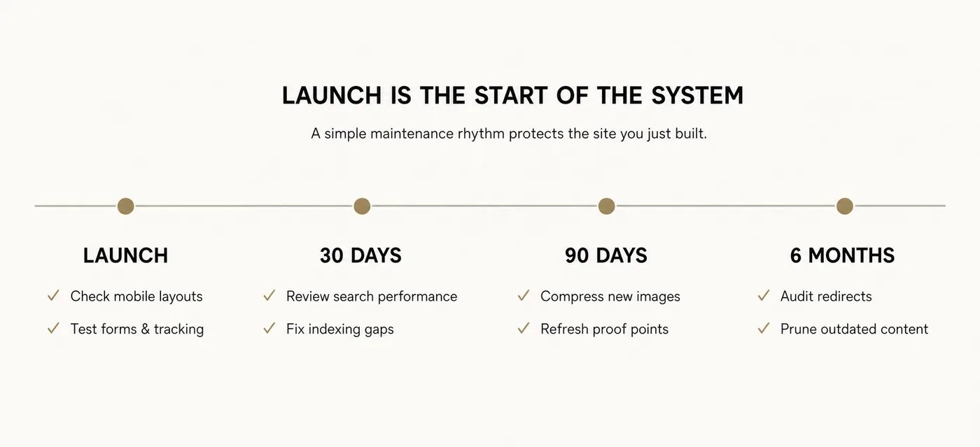
A template choice is a one-day decision. A website is a multi-year asset. The gap between those two facts is where most sites quietly decay.
Squarespace updates its editor. Plugins and embeds break. Images accumulate. Someone adds a page and forgets the redirect. Six months later the site is slower, less consistent and harder to change than it was at launch — and nobody can point to the moment it happened.
Deciding upfront who maintains the site is worth more than any template comparison you will read. Whether that is you, someone in your team, or ongoing Squarespace support, the decision should be made deliberately rather than by default.
Frequently asked questions
Does the Squarespace template you choose actually matter?
Less than most people assume. On Squarespace 7.1, every template runs on the same underlying system and shares the same section library and style controls, so your choice sets how much rebuilding you do rather than what the site is capable of. Messaging, structure, images, speed and conversion path determine the outcome.
Can I change my Squarespace template after the site is live?
On 7.1, yes — you can change styles, fonts, colours and section layouts without rebuilding the site. On the legacy 7.0 platform, switching between template families is effectively a rebuild, which is one reason 7.0 sites usually migrate rather than reskin.
What is the best Squarespace template for a consultant or coach?
There is no single best template, because the requirement is structural rather than aesthetic. Choose one whose default sections include a clear engagement or process block and a genuine proof block, and whose type hierarchy is restrained. Filter by layout, not by the industry label on the demo.
Is Squarespace Blueprint better than choosing a template?
Blueprint is a faster way to reach a starting point, and it builds on the same 7.1 system. It arranges sections competently but does not decide your positioning, your offer or your conversion path. Treat its output as a first draft rather than a finished site.
Why does my Squarespace site look different from the demo?
Almost always the photography. Demo images are professionally shot, colour-graded to sit behind text, and correctly compressed. Replacing them with unedited client photographs changes the entire impression of the page — and oversized uploads slow it down as well.
Do premium Squarespace templates rank better in Google?
No. Search performance comes from content, structure, internal linking, page speed and authority, none of which a template supplies. A well-built template makes good SEO easier to implement; it does not deliver it.
How long should choosing a template take?
Twenty minutes, once you have written your page list. Anything longer is usually a sign that the underlying decision — what the site should say and to whom — has not been made yet.
Should I fix my existing Squarespace site or start again?
If the structure and platform are sound and the problem is messaging, images or conversion path, fix it. If you are on 7.0, or the information architecture itself is wrong, rebuild. An honest audit answers this in an afternoon.
Where to go from here
If you have read this far, you probably suspect what we do: that the template was never the thing holding your website back.
It is worth finding out precisely what is. If you would like a considered second opinion, we offer a free website review — a short, honest read of your current Squarespace site covering messaging, structure, speed and search visibility, and what we would change first if it were ours.
No presentation, no obligation, and no attempt to sell you a rebuild you do not need. If a fix would serve you better than a redesign, we will say so. And if you would rather just ask a question first, get in touch.