
Is Squarespace accessible?
Squarespace is a capable foundation for an accessible website, but it does not produce one automatically. The platform designs its products with accessibility in mind, while the content you add — text, images, colours, links, forms — remains your responsibility. That division of labour is the single most important thing to understand.
In practice, accessibility on Squarespace splits into three layers:
- What Squarespace controls — the underlying template code, navigation markup, form rendering and editor features. You cannot change most of this, and it is generally serviceable.
- What you control — headings, colour choices, alt text, link wording, button labels, embedded media and layout decisions. This is where most real-world accessibility failures live.
- What neither of you fully controls — third-party embeds, booking widgets, chat plugins and code injections, which each bring their own accessibility behaviour with them.
The honest answer to "is Squarespace accessible?" is therefore: the platform rarely stops you building an accessible site, and never guarantees you one. The rest of this guide deals with the second layer — the part you can actually change this afternoon.
Summary: Squarespace provides accessible building blocks. Whether the finished site is accessible depends on how those blocks are used. No template, plan or plugin makes a Squarespace site accessible or legally compliant on its own.
What WCAG means for a service-business website
WCAG — the Web Content Accessibility Guidelines — is the international standard for web accessibility, published by the World Wide Web Consortium (W3C). The current version is WCAG 2.2, published in October 2023. When laws, contracts or procurement documents refer to an accessibility standard, they almost always mean WCAG.
WCAG organises its requirements under four principles, remembered by the acronym POUR:
| Principle | Plain-English meaning | Example on a Squarespace site |
|---|---|---|
| Perceivable | Visitors can see or hear your content | Images have alt text; text has enough contrast against its background |
| Operable | Visitors can use your site with whatever they have | Every menu, link and form works with a keyboard alone |
| Understandable | Content and controls behave predictably | Form errors say what went wrong; links say where they lead |
| Robust | Content works with assistive technology | Headings are real headings, not just big bold text |
WCAG defines three conformance levels — A, AA and AAA. Level AA is the widely accepted benchmark: it is the level referenced by UK public-sector regulations, by the US Department of Justice's rule for state and local government websites, and by the harmonised European standard (EN 301 549) that underpins the European Accessibility Act.
Three terms this article keeps separate, because they are not interchangeable:
- Accessibility best practice — anything that makes a site easier to use for disabled people, whether or not a guideline requires it.
- WCAG guidance — the specific, testable success criteria in the W3C's standard.
- Legal compliance — whatever the law actually requires of your business in your jurisdiction, which varies and is narrower than most vendors imply.
A service business does not need to memorise WCAG. It needs to know which failures are common on Squarespace sites, how to spot them, and how to fix them in the editor. That is what the framework below is for.
The SQSP 10-Point Squarespace Accessibility Audit
This is the framework SQSP Agency uses when reviewing Squarespace sites. It covers the ten dimensions where service-business sites most often fail, in the order a visitor experiences them. It is a practical audit method, not a certification of legal compliance — passing all ten points means your site follows accessibility best practice, not that a lawyer has signed it off.
Each point below has a plain-English explanation and one action you can take in Squarespace today.
| # | Dimension | The one-line test | Your one action |
|---|---|---|---|
| 1 | Structure & headings | Do headings describe the page's structure, or just its styling? | Give every page exactly one H1, then step down in order |
| 2 | Colour contrast | Can the text be read by someone with reduced vision? | Check hero and button text with a free contrast checker |
| 3 | Keyboard navigation | Can the whole site be used without a mouse? | Tab through your homepage top to bottom |
| 4 | Focus states | Can a keyboard user see where they are? | Confirm a visible outline appears on every link as you Tab |
| 5 | Images & alt text | Does every meaningful image have a text alternative? | Write alt text for your top five pages' images |
| 6 | Links & buttons | Does each link make sense out of context? | Rewrite every "Learn more" and "Click here" |
| 7 | Forms & labels | Does every field say what it wants, even when it fails? | Submit your contact form empty and read the errors |
| 8 | Video, animation & motion | Can visitors stop movement and read captions? | Caption your videos; remove autoplaying motion |
| 9 | Mobile accessibility | Does everything above still hold at phone size? | Repeat checks 1–7 on your phone |
| 10 | Manual + automated testing | Have you tested with both a tool and a human? | Run one automated scan, then one keyboard-only session |
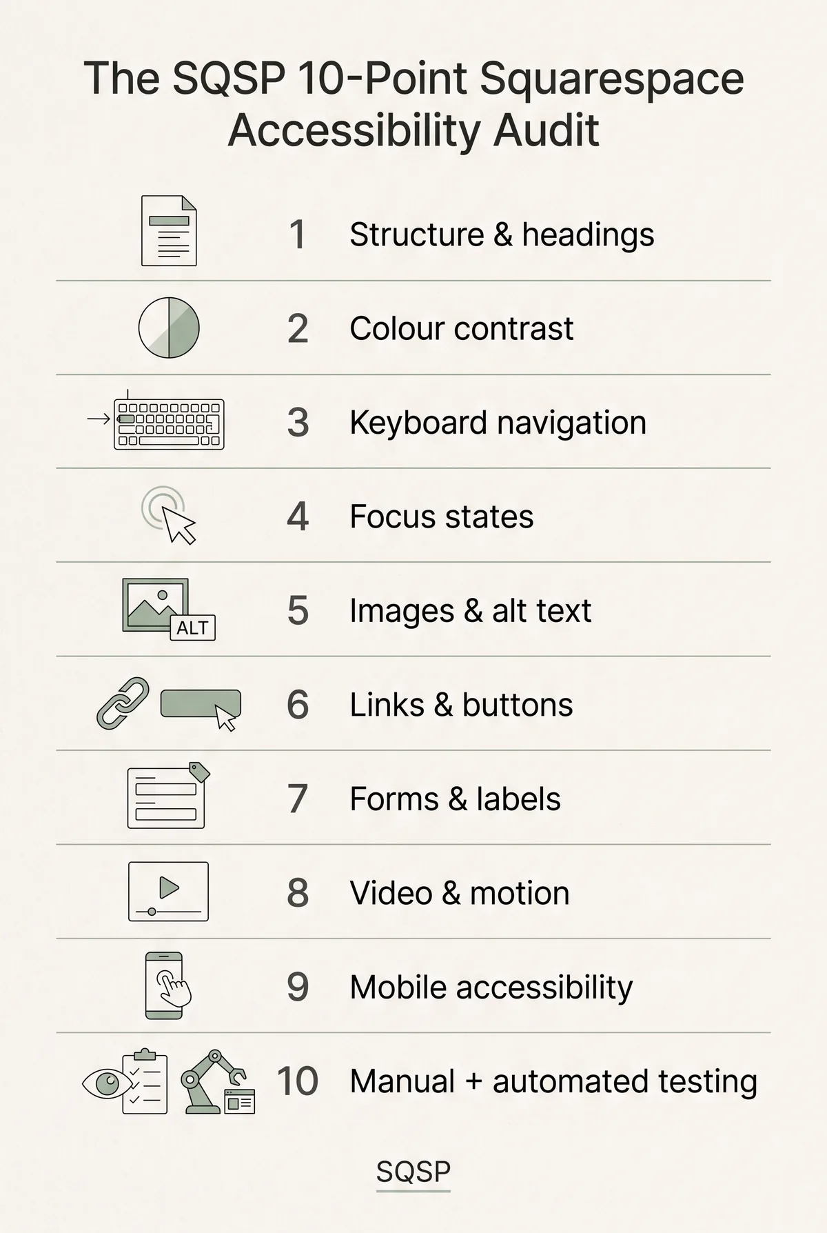
The sections that follow take each dimension in turn.
Page structure and headings
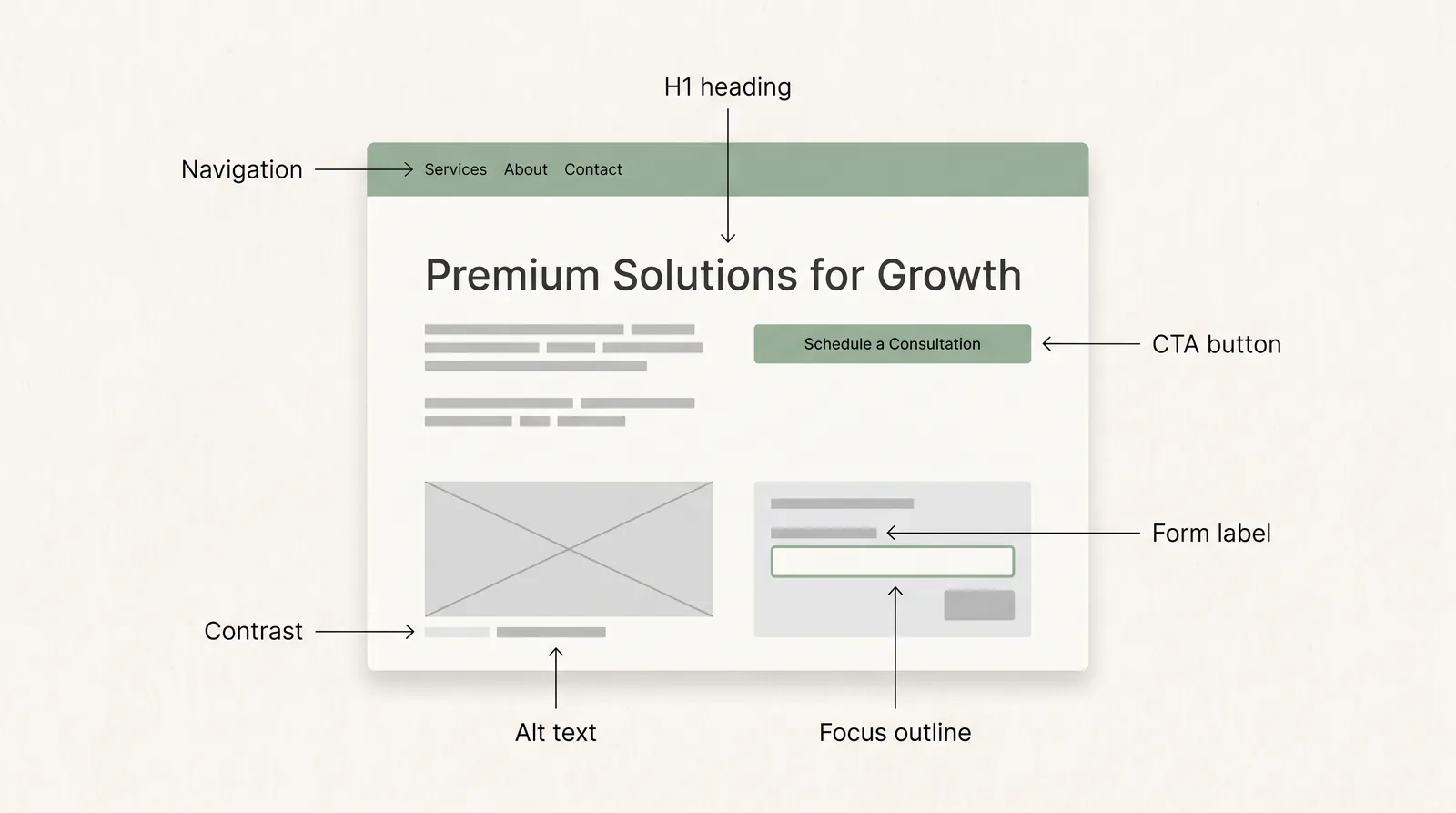
Headings are the skeleton of your page. Screen-reader users navigate by jumping between them — so headings chosen for their visual size, rather than their meaning, leave those visitors lost.
In the Squarespace editor, the text styles Heading 1 through Heading 4 are real HTML headings (<h1>–<h4>), and that is exactly why the common habit is harmful: picking "Heading 3 because it looks the right size" creates a structure that reads as gibberish to assistive technology.
The rules are simple:
- One H1 per page, stating what the page is about. On Squarespace this is usually your page title or the first heading in your top section.
- H2s for the main sections of the page — your services, your approach, your testimonials.
- H3s only inside an H2 section. Never skip levels downwards (an H4 directly under an H1 signals a missing layer of structure).
- Never use a heading style to make ordinary text bigger. If it isn't a section title, style it as paragraph text and adjust the size in your site styles instead.
Your one action: Open your most important page, list its headings in order (the free WAVE browser extension shows this in one click), and check the outline reads like a sensible table of contents.
Colour contrast
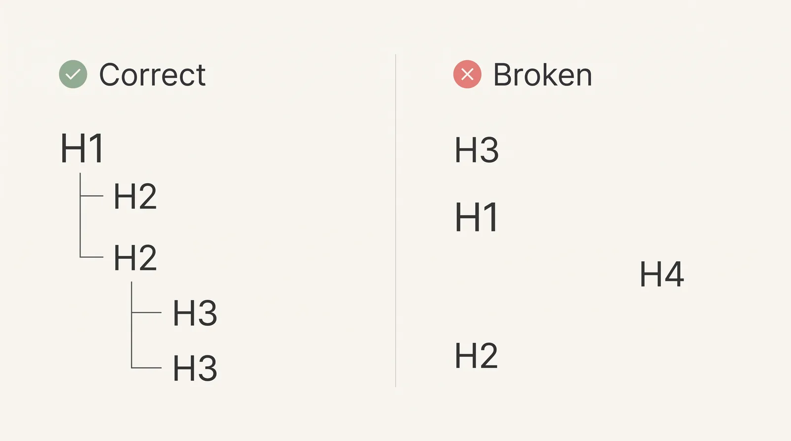
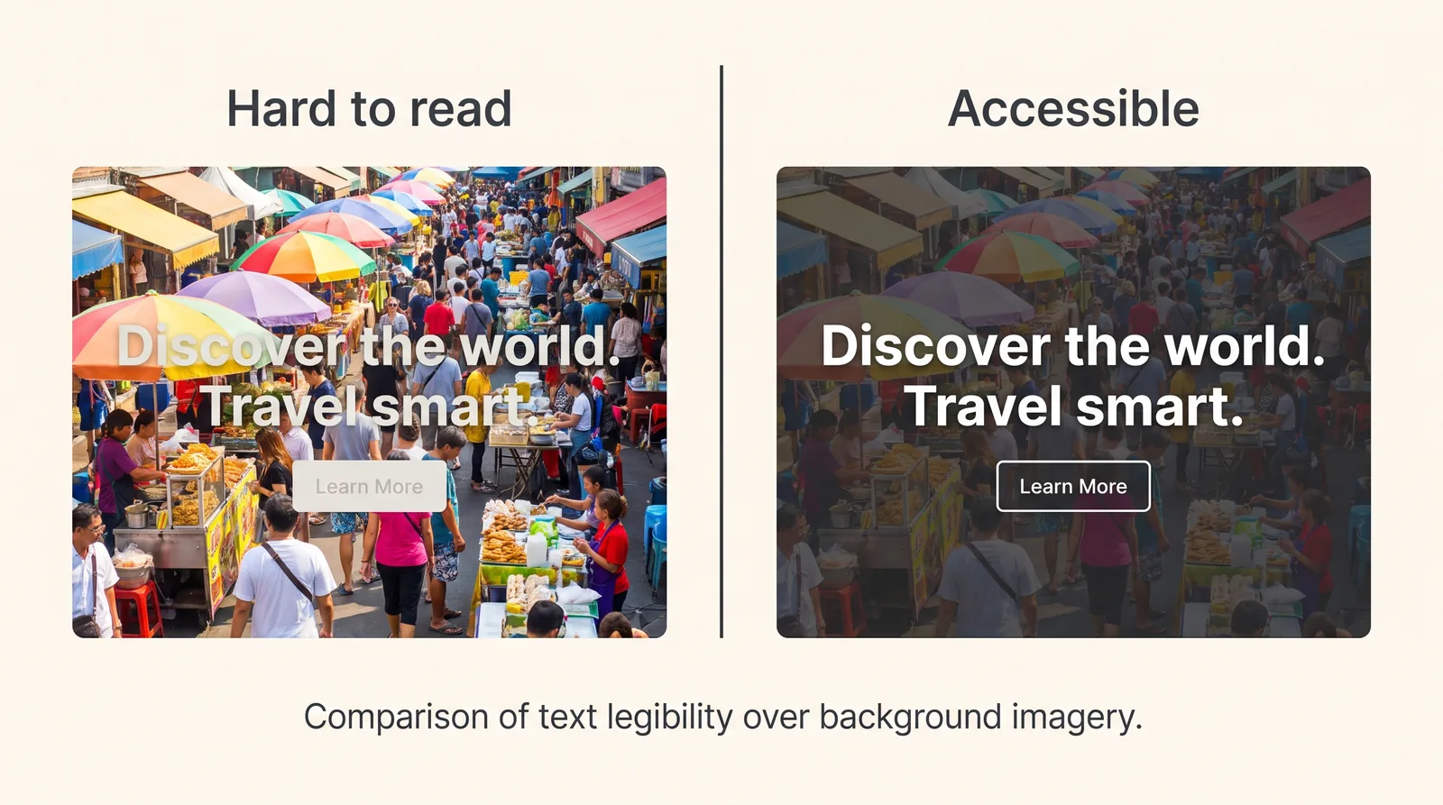
Contrast is the ratio between your text colour and its background. WCAG 2.2 Level AA requires at least 4.5:1 for normal text and 3:1 for large text (roughly 24px, or 19px bold, and above). Low contrast is consistently among the most common accessibility failures on the web — and it is rife on design-led Squarespace sites, because soft grey-on-white and text-over-photography are fashionable.
The places Squarespace sites most often fail:
- Hero text over background images, especially where the image has bright or busy areas behind the words.
- Muted brand palettes — pale grey body text, beige-on-cream section styling, low-contrast footer text.
- Buttons whose label colour sits too close to the button fill, particularly on hover.
- Placeholder text used as the only label in forms — placeholder grey rarely passes, and it vanishes the moment someone starts typing.
None of this requires abandoning a refined palette. It usually means darkening one grey by a couple of shades, adding a subtle overlay behind hero text, or reserving the palest tones for decorative elements rather than words.
Your one action: Put your body text colour and background into the free WebAIM Contrast Checker (webaim.org/resources/contrastchecker). Then do the same for your primary button. Fix anything under 4.5:1 in Site Styles — it is a two-minute change that improves the site for every visitor reading on a phone in daylight, not only those with low vision.
Keyboard navigation and focus states
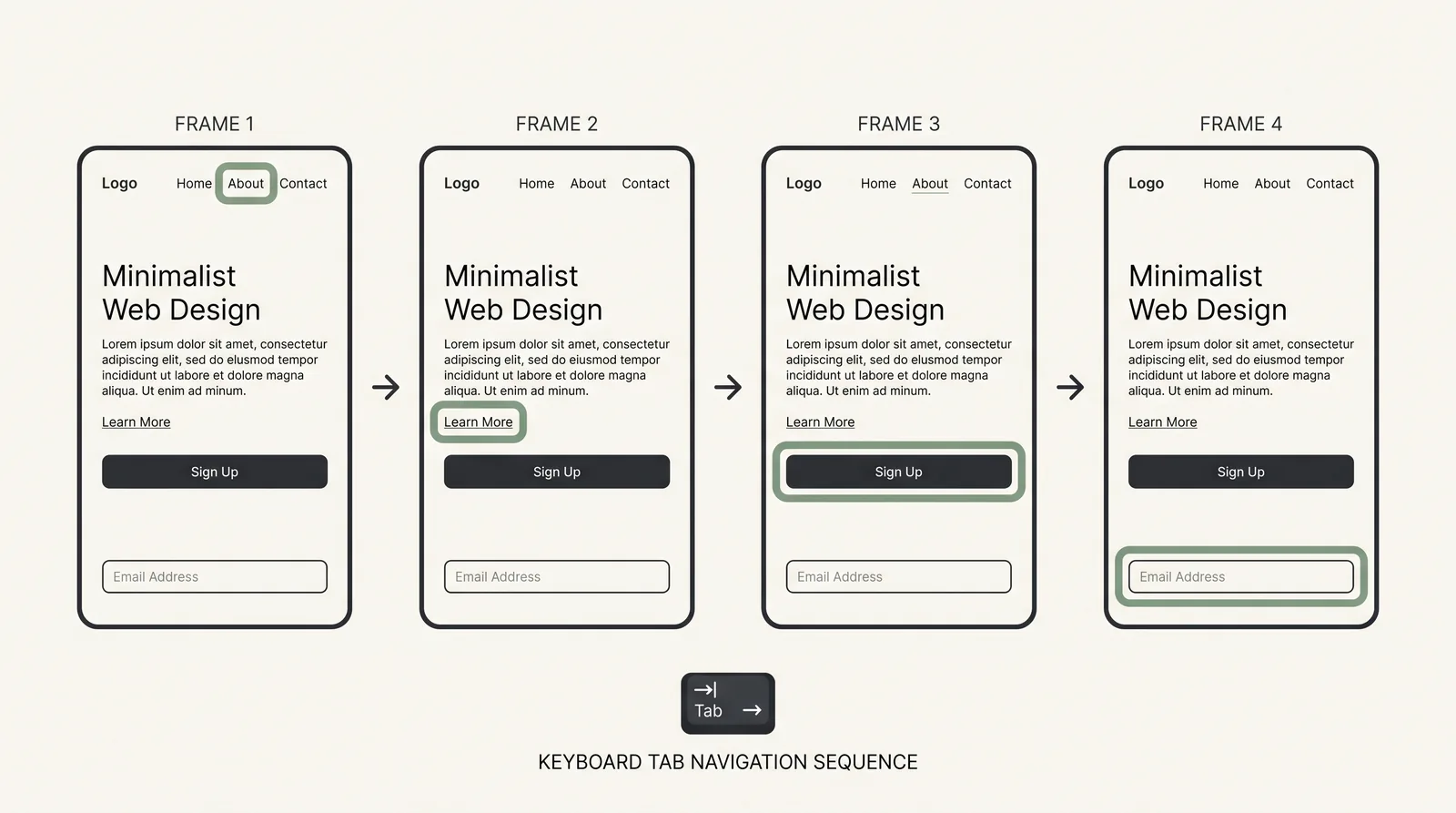
A significant group of visitors never touch a mouse — people with motor impairments, screen-reader users, people with tremors or RSI, and power users. For them, the Tab key is the site. Every link, button, menu item and form field must be reachable and usable with the keyboard alone, and — the part sites most often get wrong — the visitor must be able to see where they are.
That visible marker is the focus state: the outline or highlight that appears on the element currently selected as you Tab. Browsers draw one by default. Problems arise when custom styling suppresses it, or when a template's focus outline is so faint it disappears against the brand colours — which is why you should test yours rather than assume.
What to check on a Squarespace site:
- Tab order follows the visual order — top navigation, then page content, then footer.
- Every interactive element receives focus — including items inside folders/drop-down navigation and any burger menu.
- The focus indicator is visible on every background your site uses, including dark sections.
- Nothing traps the keyboard — pop-ups, embedded booking widgets and galleries must be escapable with Esc or Tab.
Your one action: Click into your browser's address bar, then press Tab repeatedly and travel your entire homepage. If at any point you cannot tell where you are, or you cannot reach something a mouse user could click, you have found a genuine accessibility failure.
Images and alt text
Alt text is the written alternative a screen reader speaks when it reaches an image. In Squarespace, image blocks and gallery images provide a field for it — check each block type you actually use, because entry points differ between blocks.
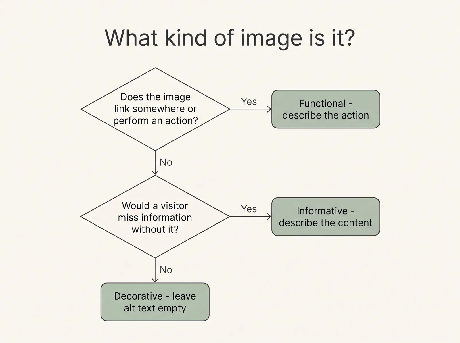
The skill is not writing alt text — it is deciding what kind of image you are dealing with:
- Informative images (a photo of your clinic, a chart, a portrait of you): describe what the image conveys, in one sentence, without opening with "image of".
- Functional images (a logo that links home, an icon that acts as a button): describe the destination or action, not the picture — "SQSP Agency home", not "blue logo".
- Decorative images (abstract textures, mood photography that adds nothing a visitor must know): these should be silent for screen-reader users. Leave the alt field genuinely empty rather than writing "decorative image" — a screen reader will read whatever you type.
- Background/section images are treated as decorative; never put content that matters (like text baked into an image) in a background.
One warning for service businesses: do not stuff keywords into alt text. "Therapist London counselling anxiety therapy CBT" is useless to a blind visitor and reads as spam to search engines. Describe the image; if a keyword belongs naturally, fine.
Your one action: Open your five most-visited pages and write alt text for every informative image, leaving decorative ones empty. This is typically under an hour of work for a service-business site.
Links and buttons
Screen-reader users often pull up a list of every link on the page and navigate from that list alone. Out of context, "Learn more" appears six times and says nothing. Link and button wording is the cheapest accessibility fix in this entire guide, and one of the highest-value.
The standard: every link should make sense read in isolation.
- "Learn more" → "See our counselling services"
- "Click here" → "Download the pricing guide (PDF)"
- "Read more" (on six blog cards) → the article's own title as the link
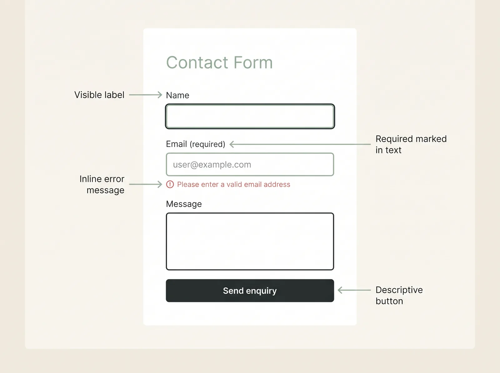
- "Submit" → "Send enquiry" or "Book a consultation"
Two further habits worth adopting:
- Links that open a new tab or download a file should say so in the link text — "(opens in new tab)", "(PDF, 2 MB)" — because an unannounced context switch is disorienting for screen-reader and cognitive-accessibility reasons alike.
- Don't rely on colour alone to mark links inside body text. If your links are only distinguishable by a subtle colour shift, add an underline in Site Styles.
There is a conversion-rate bonus here that has nothing to do with disability: specific, outcome-describing buttons are simply better copy than "Submit". Accessibility and persuasion point the same direction.
Your one action: Search each key page for "learn more", "click here", "read more" and "submit", and rewrite every one to describe its destination.
Forms and error states
Your contact form is the single most commercially important element on a service-business website — and the place where an accessibility failure literally costs you the enquiry.
What an accessible form needs:
- A visible label attached to every field. Placeholder text is not a label: it disappears on typing, usually fails contrast, and is inconsistently announced by assistive technology. Squarespace's form block renders field labels — keep them switched on and descriptive.
- Required fields marked in text, not by colour or an unexplained asterisk alone.
- Error messages that say what went wrong and where. "Please enter a valid email address" beside the field beats a red border and silence. Test this yourself: submit the form empty and read what comes back.
- No unlabelled CAPTCHA-style barriers without an accessible alternative.
- A clear confirmation after submission — a visitor using a screen reader should hear that the message was sent.
Your one action: Go to your own contact form, submit it empty, and experience your error state as a stranger would. Then fill it in using only the keyboard. If either test frustrates you, it is losing you enquiries from visitors with far less patience and far more reason to leave.
Video, animation and motion
Movement on a page is an accessibility issue in two directions: content people can't perceive (uncaptioned video) and content people can't tolerate (motion that triggers vestibular disorders, or distracts visitors with attention or cognitive differences).
For video:
- Captions for anything with speech. If you host on YouTube or Vimeo and embed into Squarespace, use their captioning tools — but edit the auto-captions, which mangle names and terminology.
- Don't autoplay video with sound. If a background video autoplays silently, ensure it carries no information a visitor would need.
- Provide a transcript for content-heavy video (an "about me" video for a therapist, say). It also happens to be the most machine-readable version of your message.
For animation and motion:
- Anything that moves for more than five seconds should be pausable or stoppable — that includes auto-advancing galleries and carousels, which Squarespace makes easy to add and visitors find hard to read.
- Nothing should flash more than three times per second.
- Respect reduced-motion preferences where you can. Operating systems let users request less motion; heavy scroll animations and parallax effects ignore that request unless the site honours it. On Squarespace, the practical version of this rule is restraint: prefer subtle or no entrance animations in Site Styles.
Your one action: If your site has an auto-advancing carousel or an autoplaying background video, decide today whether it earns its place. For most service businesses the honest answer is no — and static alternatives are calmer, faster and easier to read for everyone.
Mobile accessibility
More than half of most service businesses' traffic is mobile, and every desktop accessibility issue has a mobile twin — usually a worse one. Small screens shrink touch targets, tighten spacing and amplify contrast problems in daylight.
The mobile-specific checks:
- Touch targets: buttons and links need to be comfortably tappable — WCAG 2.2 introduced a minimum target-size criterion, and the practical rule is that no two tap targets should be so close that a thumb hits the wrong one. Watch for stacked text links in footers and cramped social icons.
- Text size and zoom: body text should be legible without zooming (16px is a sensible floor), and the site must not block pinch-to-zoom — a restriction usually introduced by custom code rather than the platform, but worth testing on your own phone.
- The mobile menu: the burger menu must open, close, and be operable by keyboard and screen reader, and the tap target for it must be generous.
- Content parity: anything hidden on mobile for layout reasons is information some visitors never receive. Hide decoration, not content.
- Reflow: at small sizes, content should reflow into one column rather than forcing horizontal scrolling.
Your one action: Repeat the heading, contrast, link and form checks from earlier sections on your own phone — outdoors, in daylight, one-handed. That single change of context surfaces more real-world issues than any tool.
Manual versus automated accessibility testing
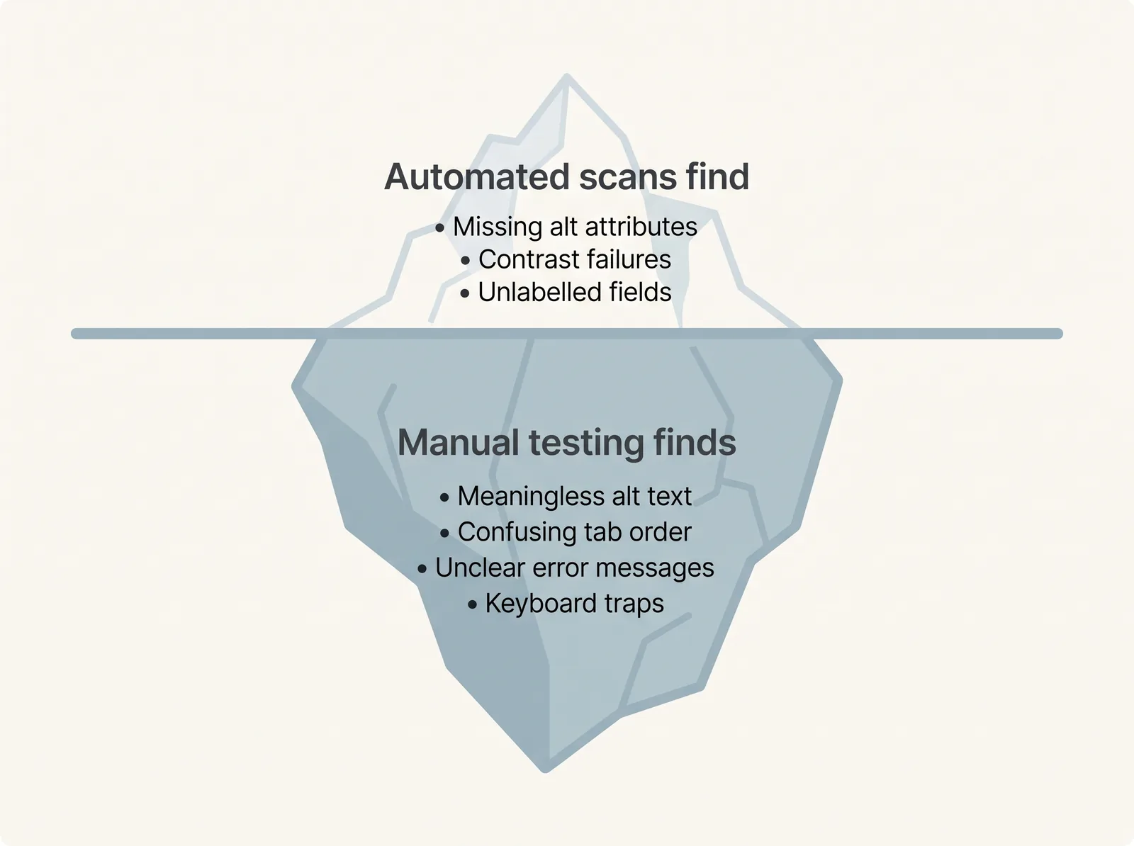
Automated scanners catch, at best, a minority of accessibility issues — the mechanical ones. The failures that actually exclude people mostly require a human. Both kinds of testing matter; confusing one for the other is how sites end up with a passing score and an unusable contact form.
| Automated scan | Manual testing | |
|---|---|---|
| What it is | A tool (WAVE, Lighthouse, axe) reads the page code and flags rule violations | A person uses the site with a keyboard, a screen reader, or altered settings |
| Catches | Missing alt attributes, contrast failures, missing form labels, broken heading order | Whether alt text is meaningful, whether Tab order makes sense, whether errors are understandable, whether the experience is actually usable |
| Misses | Everything requiring judgement — which is most of WCAG | Little, but slower and needs a method |
| Cost | Free, minutes | Free (DIY basics) to professional audit fees |
| Right role | Regular smoke test; catches regressions | Periodic deep check; the real verdict |
A sensible rhythm for a service business: an automated scan of key pages whenever you make significant changes, and a manual keyboard-and-screen-reader pass a couple of times a year or after a redesign. The 15-minute check later in this article is the DIY version of that manual pass.
Accessibility mistakes on otherwise beautiful Squarespace websites
Design-led sites fail in design-led ways. These are the patterns that most often undermine polished, professional Squarespace sites — the kind whose owners are certain they don't have an accessibility problem.
- The elegant grey that fails contrast. A muted palette applied to body text, not just accents.
- Headings chosen by size, not structure. The page looks organised; its outline is chaos.
- Hero text over photography with no overlay. Legible on the designer's monitor, gone in daylight.
- "Learn more" as the universal link. Six identical links, six different destinations.
- Placeholder-only form fields. Minimalist until someone mid-form forgets what the third field asked for.
- The auto-advancing testimonial carousel. Praise nobody can finish reading, and a moving element that can't be paused.
- Icon-only social links and buttons with no accessible name. Silent to a screen reader.
- Decorative fonts at small sizes. A script typeface that is a logo, not a body text.
- PDF brochures as the only source of key information — pricing or service details locked in an untagged PDF.
- The accessibility overlay widget installed as a fix — of which more in section 15.
Every one of these is fixable inside Squarespace without touching code, and most take minutes.
Accessibility and SEO: where they genuinely overlap
Accessibility is not an SEO strategy, and this article won't pretend otherwise. But several accessibility practices and search-engine requirements are the same work done once — because search engine crawlers and assistive technologies both consume the structure of your page rather than its appearance.
The genuine overlaps:
- Heading hierarchy. A logical H1→H2→H3 outline is how screen readers navigate and how search engines understand a page's topic structure.
- Alt text. Written for humans first, it also gives image search and AI systems an accurate description of your images.
- Descriptive link text. Helps screen-reader users and gives search engines context about the destination page.
- Transcripts and captions. Make video perceivable — and make its content indexable text.
- Clear structure and plain language. The same qualities that help visitors with cognitive differences make your pages easier for AI answer engines to extract and cite accurately.
What accessibility is not: a ranking shortcut. Fix your contrast because visitors deserve to read your prices, not because of an imagined algorithm boost. For the search side of running a Squarespace site, see our complete Squarespace SEO guide — the two disciplines share foundations but have different jobs.
Can an accessibility plugin make Squarespace compliant?
No. Accessibility overlay widgets — the floating toolbar plugins that promise one-line-of-code compliance — cannot make a Squarespace site accessible, and cannot make it legally compliant.
An overlay is a script that sits on top of your existing page and offers adjustments: bigger text, different contrast, a screen-reader mode. The problems are structural:
- It cannot fix your content. No script can write meaningful alt text for your photographs, restructure your headings, or reword "Click here". The underlying failures remain.
- Assistive technology users largely already have better tools. Screen readers, magnifiers and OS-level settings are configured to each user's needs; an overlay adds an unfamiliar layer on top — and in practice, many assistive-technology users report that overlays interfere with the tools they rely on.
- It does not remove legal exposure. Businesses using overlays have continued to receive accessibility complaints and demand letters; an overlay badge is not a compliance certificate, and no reputable authority treats it as one.
Overlays are seductive for exactly the reason they fail: they promise that accessibility is a product you install rather than a property of how your site is built. On Squarespace, the genuine fixes — headings, contrast, alt text, labels, link wording — are editor-level work you can do yourself, mostly faster than configuring the widget that wouldn't have fixed them.
Summary: Accessibility overlay plugins do not make a website WCAG-conformant or legally compliant. They cannot repair content-level failures, and they can actively interfere with the assistive technology real users depend on. Fix the site, not the symptom.
The European Accessibility Act: what business owners should know
SQSP Agency provides general information here, not legal advice. Accessibility obligations differ by country, sector and business size — for decisions about your own exposure, speak to a qualified solicitor.
The European Accessibility Act (EAA) is EU Directive 2019/882. Its requirements began applying on 28 June 2025, and it covers specified products and services sold to consumers in the EU — including e-commerce services. Because it applies to sales into the EU, it can matter to a UK business even after Brexit: if you sell services online to consumers in EU member states, the Act may reach you.
The points a service-business owner actually needs:
- It is about specific services, not "all websites". The EAA targets defined categories — e-commerce, banking, transport, e-books and others. A brochure website with a contact form is in a different position from a site selling digital products or taking payments from EU consumers. Whether your Squarespace site falls in scope depends on what it does, not the fact that it exists.
- There is a microenterprise exemption for services. Service providers with fewer than 10 employees and no more than €2 million in annual turnover are exempt from the Act's service requirements. Many readers of this article will fall under that threshold — but "exempt from the EAA" is not "exempt from all accessibility law".
- The technical benchmark is aligned with WCAG. The European standard used to demonstrate conformity (EN 301 549) incorporates WCAG Level AA — so the practical work described in this article is the same work the EAA points at.
- In the UK itself, the Equality Act 2010 has long required service providers to make reasonable adjustments for disabled people, and this is generally understood to extend to websites — though it does not prescribe WCAG or any specific standard, and obligations are assessed case by case. Separate, stricter rules apply to UK public-sector websites.
- In the US, the ADA is the relevant law; the Department of Justice has issued a specific WCAG-based rule for state and local government websites, while the position for private businesses continues to rest on case law rather than a fixed technical standard.
The honest summary: most small service businesses are unlikely to face identical, prescriptive obligations — but the legal direction of travel everywhere is toward WCAG AA, and the reputational and commercial case doesn't wait for a statute. Building accessibly now is cheaper than retrofitting under pressure later.
The 15-minute DIY Squarespace accessibility check
You do not need tools, training or a budget to find your site's most serious issues. Set a timer and work through this on your own homepage and contact page.
Minutes 0–3 — Headings. Install the free WAVE browser extension (wave.webaim.org) and run it on your homepage. Open the Structure panel and read the heading outline. One H1? Sensible order? Note anything that reads like a jumble.
Minutes 3–6 — Keyboard. Click the address bar, then Tab through the entire page. You are checking two things: can you reach everything, and can you always see where you are. Open the mobile-style menu if your site uses one. Press Esc on anything that pops up.
Minutes 6–9 — Contrast. Take your body text colour and background (Site Styles shows the hex codes) and test them at webaim.org/resources/contrastchecker. Repeat for your primary button. Under 4.5:1 for body text means a fix is needed.
Minutes 9–12 — Form. Submit your contact form empty. Are the errors clear, specific and positioned by the fields? Now complete it with the keyboard only. Are all fields labelled with visible text, not just placeholder hints?
Minutes 12–15 — Links and images. Scan the page for "learn more" / "click here" / bare "submit" and list them for rewriting. Then check your five most prominent images: do the informative ones have alt text that actually describes them?
Score yourself honestly. Every issue this pass surfaces is fixable in the editor — most of them the same day.
When professional help makes sense
Most of this article is deliberately DIY: the highest-impact fixes on a Squarespace site are content-level decisions you can make yourself. Professional help earns its fee in specific situations:
- You've run the 15-minute check and found problems you can't diagnose — a keyboard trap in an embedded widget, a template-level focus issue, contrast failures that seem to come from nowhere.
- Your site mixes Squarespace with code injections and third-party embeds (booking systems, chat, payment flows), where issues live below the editor.
- You're redesigning anyway. Building accessibility in during a website redesign costs almost nothing; retrofitting it afterwards costs a project. If a redesign is on your horizon, make WCAG-aware structure part of the brief from day one.
- You need one focused session, not a project. A single expert Fix Session sorting headings, contrast, focus states and form errors across a site is often all a small service business needs — and ongoing Squarespace support covers the rest as your site evolves.
- You genuinely may have legal exposure — you sell into the EU at scale, hold public-sector contracts, or have received a complaint. That is the moment for a formal audit and a solicitor, not a blog post.
You can see how these decisions play out in a finished build in our Impact Physio case study — structure, contrast and forms handled from the first wireframe rather than patched afterwards.
Not sure which of these describes your site? That uncertainty is itself the answer to start with — see the review offer below.
Final checklist
The complete SQSP 10-Point Audit, in checkbox form. Print it, or save the infographic above.
- 1. Structure & headings — one H1 per page; H2/H3 nested in order; no headings used for visual size
- 2. Colour contrast — body text ≥ 4.5:1; large text and buttons ≥ 3:1; hero text legible over imagery
- 3. Keyboard navigation — every link, menu, button and field reachable by Tab; no traps; Esc closes overlays
- 4. Focus states — a clearly visible indicator on every interactive element, on every background colour
- 5. Images & alt text — informative images described; functional images named by action; decorative images left empty
- 6. Links & buttons — every link meaningful out of context; no bare "learn more" / "click here" / "submit"; new-tab and file links announced
- 7. Forms & labels — visible labels on all fields; required fields marked in text; specific inline error messages; keyboard-completable
- 8. Video, animation & motion — captions on speech; no autoplaying sound; moving content pausable; minimal entrance animation
- 9. Mobile — generous tap targets; zoom not blocked; mobile menu fully operable; no content hidden on small screens; no horizontal scroll
- 10. Testing — automated scan on key pages after changes; manual keyboard + screen-reader pass periodically; both, not either
Not sure whether your Squarespace site has accessibility, usability or SEO problems? Request a free Squarespace website review. We'll look at your site the way this article does — structure, contrast, navigation, forms — and tell you plainly which issues are worth fixing first, and which aren't worth worrying about. No obligation, no hard sell.
Frequently asked questions
Is Squarespace WCAG compliant?
No platform can truthfully claim its sites are "WCAG compliant", because conformance depends on the content each owner adds. Squarespace designs its products with accessibility in mind, and its templates provide workable foundations — semantic headings, labelled forms, keyboard-reachable navigation. Whether a finished Squarespace site meets WCAG Level AA depends on your headings, colours, alt text, links and forms.
Is a Squarespace website automatically accessible?
No. Squarespace provides accessible building blocks, but the most common accessibility failures — low-contrast text, headings chosen by size, missing alt text, vague link wording, placeholder-only forms — are all created in the editor by the site owner. Two sites on the same template can sit at opposite ends of the accessibility spectrum. The platform rarely prevents accessibility; it never guarantees it.
Does Squarespace support keyboard navigation?
Broadly, yes — standard Squarespace navigation, links, buttons and form fields can be reached and operated with the keyboard. The practical risks are visibility and additions: focus indicators can be hard to see against certain brand palettes, and third-party embeds or code injections can introduce keyboard traps. Test it yourself: Tab through your homepage and confirm you can always see and reach everything.
Can you add alt text in Squarespace?
Yes. Squarespace provides alt-text fields for its main image contexts, including image blocks and gallery images. Describe informative images in one plain sentence, give functional images (like a linked logo) the name of their destination, and leave genuinely decorative images empty. Avoid keyword-stuffing — alt text exists for people who cannot see the image, not for search engines.
Do accessibility plugins make a website compliant?
No. Overlay widgets add an adjustment toolbar on top of your page, but they cannot fix content-level failures — meaningless alt text, broken heading structure, vague links, unlabelled fields — which are where most real barriers live. Many assistive-technology users find overlays interfere with tools they already use, and installing one does not remove legal exposure. Fixing the underlying site is more effective and, on Squarespace, usually straightforward.
Does website accessibility help SEO?
Partially, and honestly: several accessibility practices double as search fundamentals — logical heading structure, descriptive alt text, meaningful link wording, transcripts for video — because crawlers and screen readers both consume page structure. But accessibility is not a ranking shortcut, and no contrast fix will rescue weak content. Treat the overlap as the same good work done once, not as an SEO tactic.
How can I test a Squarespace website for accessibility?
Combine one automated tool with one manual pass. Run the free WAVE extension or Lighthouse on your key pages to catch mechanical issues (missing alt attributes, contrast failures, unlabelled fields). Then spend fifteen minutes testing by hand: Tab through the whole page, submit your form empty, check the heading outline, and read your alt text aloud. Automated tools catch only a minority of issues — the manual pass is the real verdict.
Does the European Accessibility Act apply to small businesses?
Often not directly. The EAA (EU Directive 2019/882, applying since 28 June 2025) covers specific consumer-facing services — including e-commerce — sold into the EU, and exempts microenterprise service providers with fewer than 10 employees and no more than €2 million turnover. A small brochure-site business is in a very different position from one selling digital products to EU consumers. This is general information, not legal advice — obligations vary by country, sector and what your site actually does.